Ondo Protocol Identity
The team at Ondo wanted to explore a new brand identity while updating their current marketing website. Their goal was to create branding that was utilitarian and easy to implement, while being modern and bold.
Our aim was to embody a feel that was very digital, technical, architectural and conceptual in approach. We created a vibrant identity system and a visual theme of data-visualization that feels like a glitch or a feedback loop.
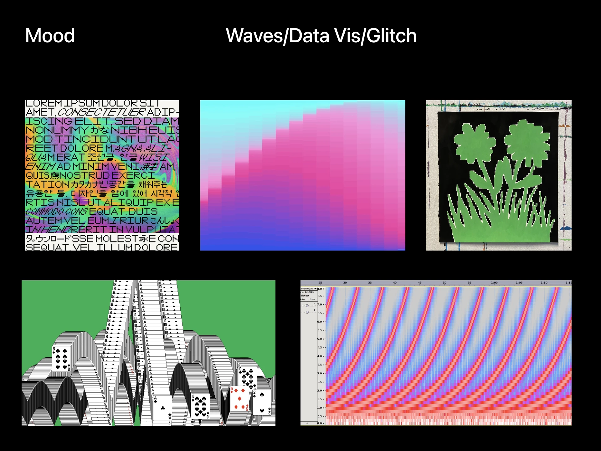
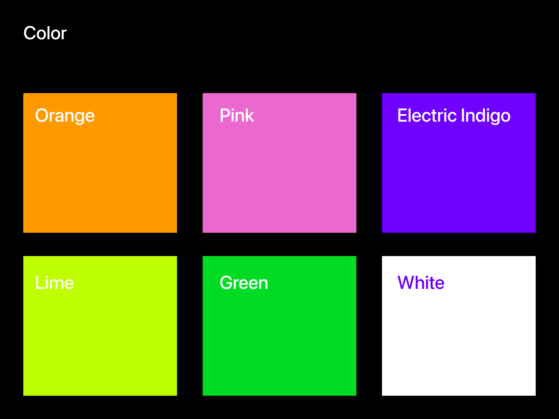
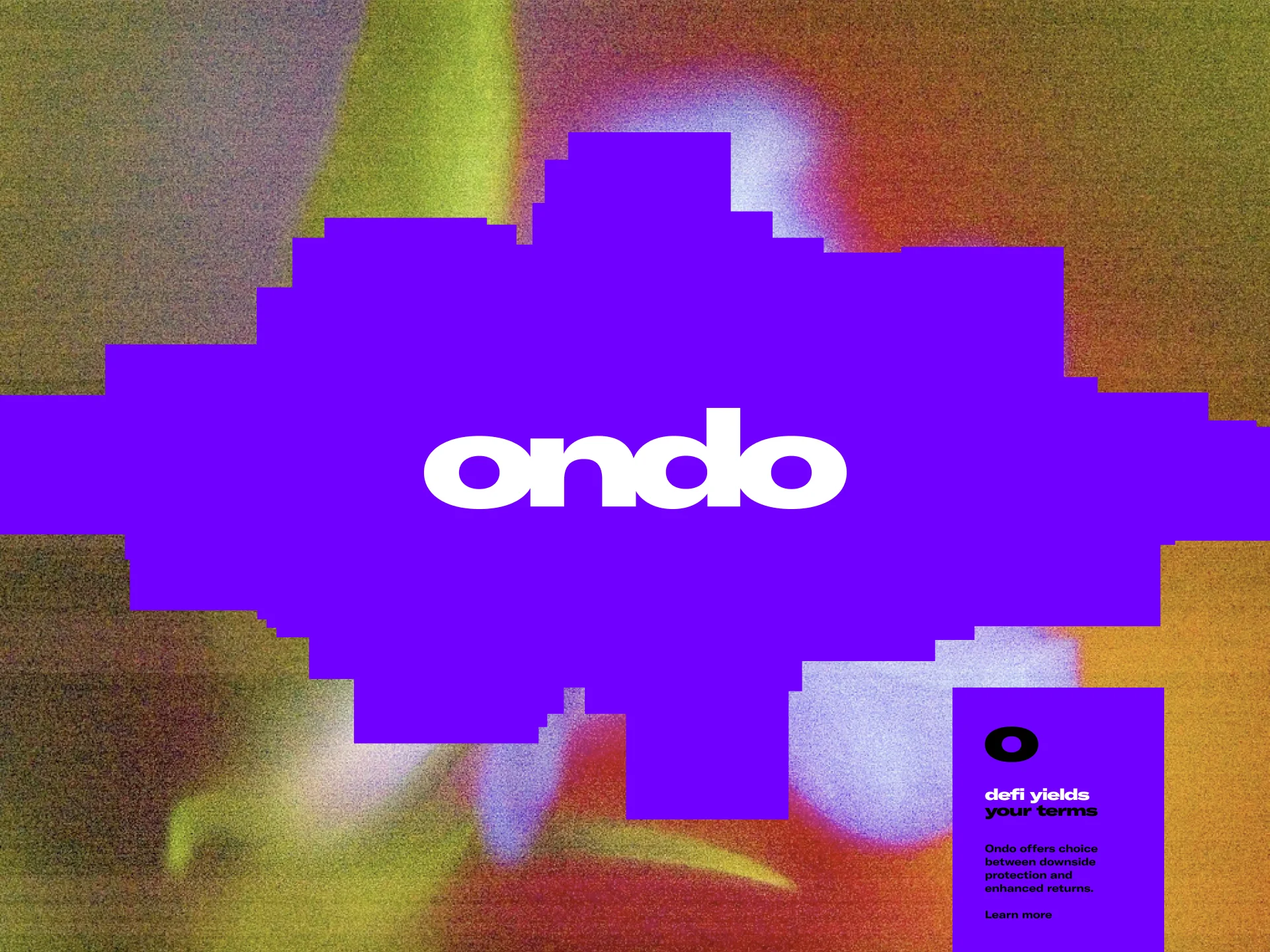
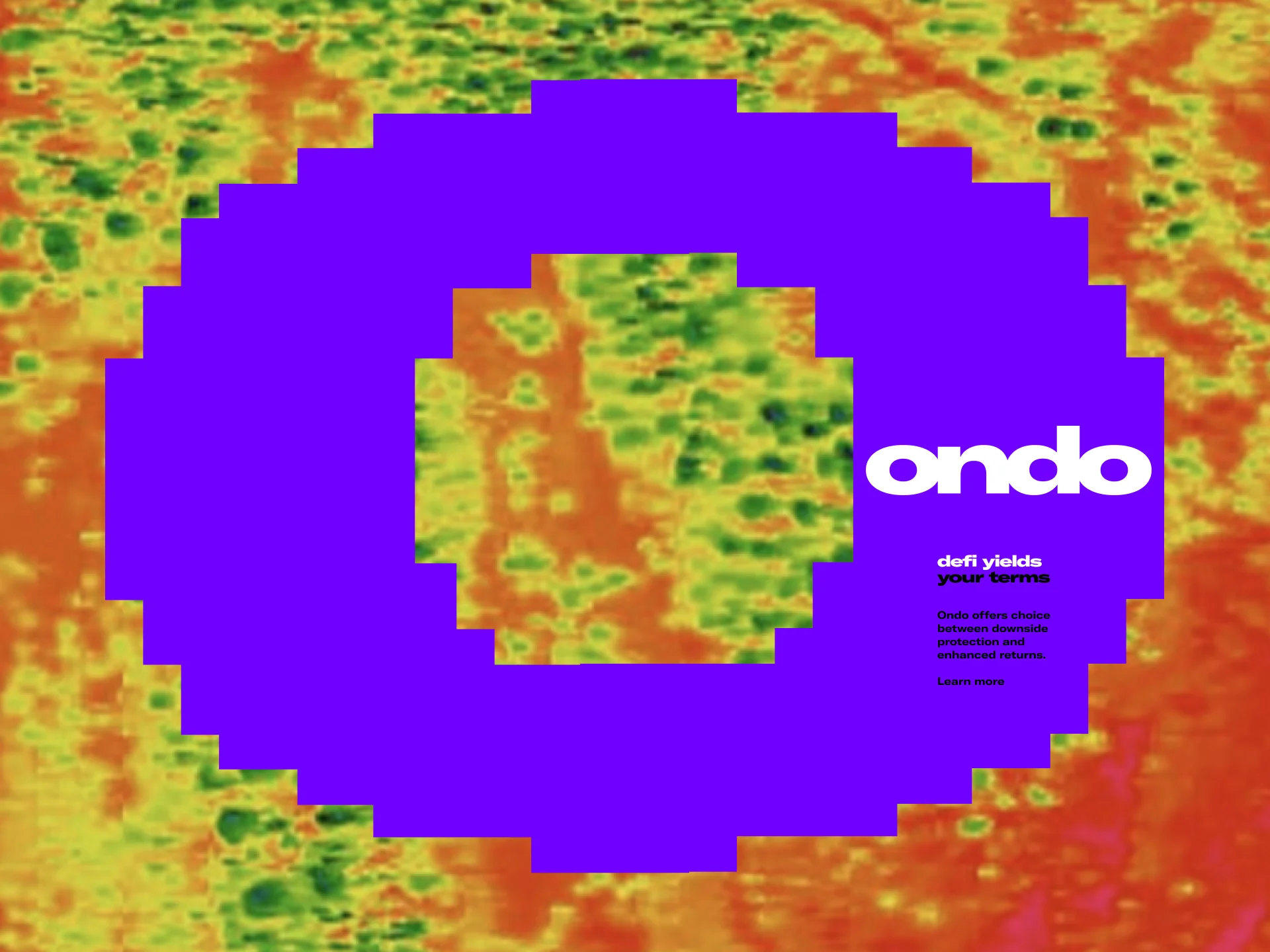
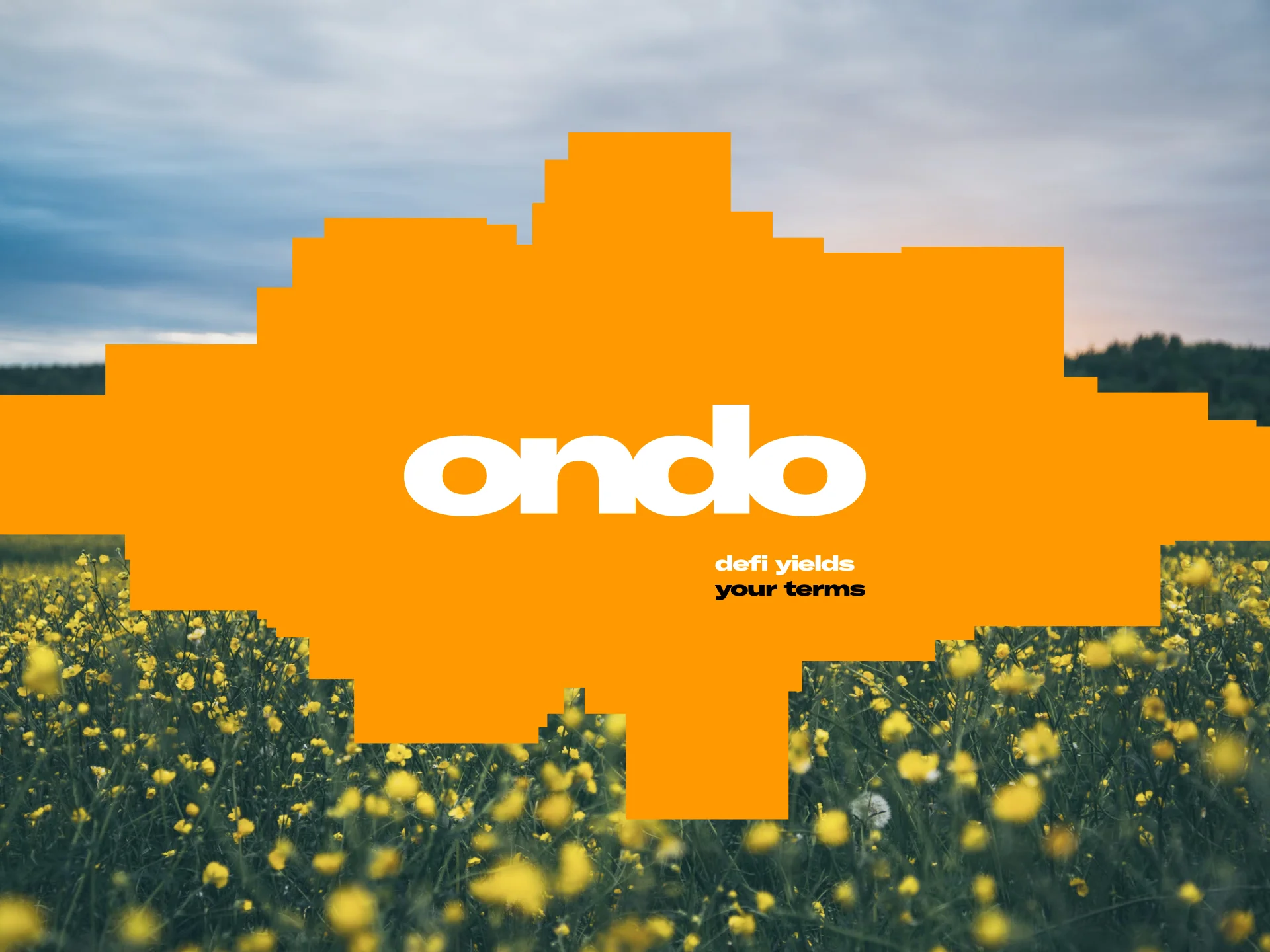
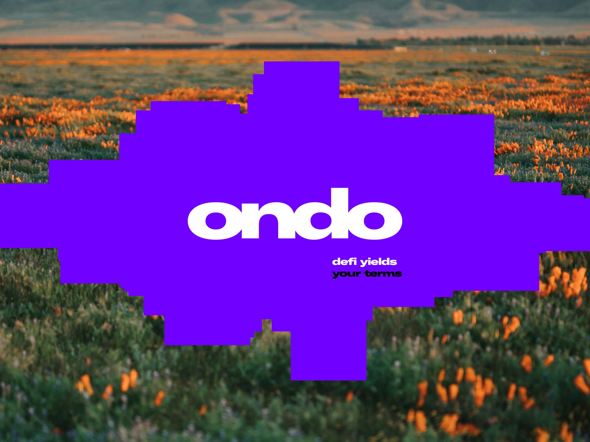
While the initial direction proved too bold for some of their applications we took the time to clean up and simplify their existing logo and word mark.

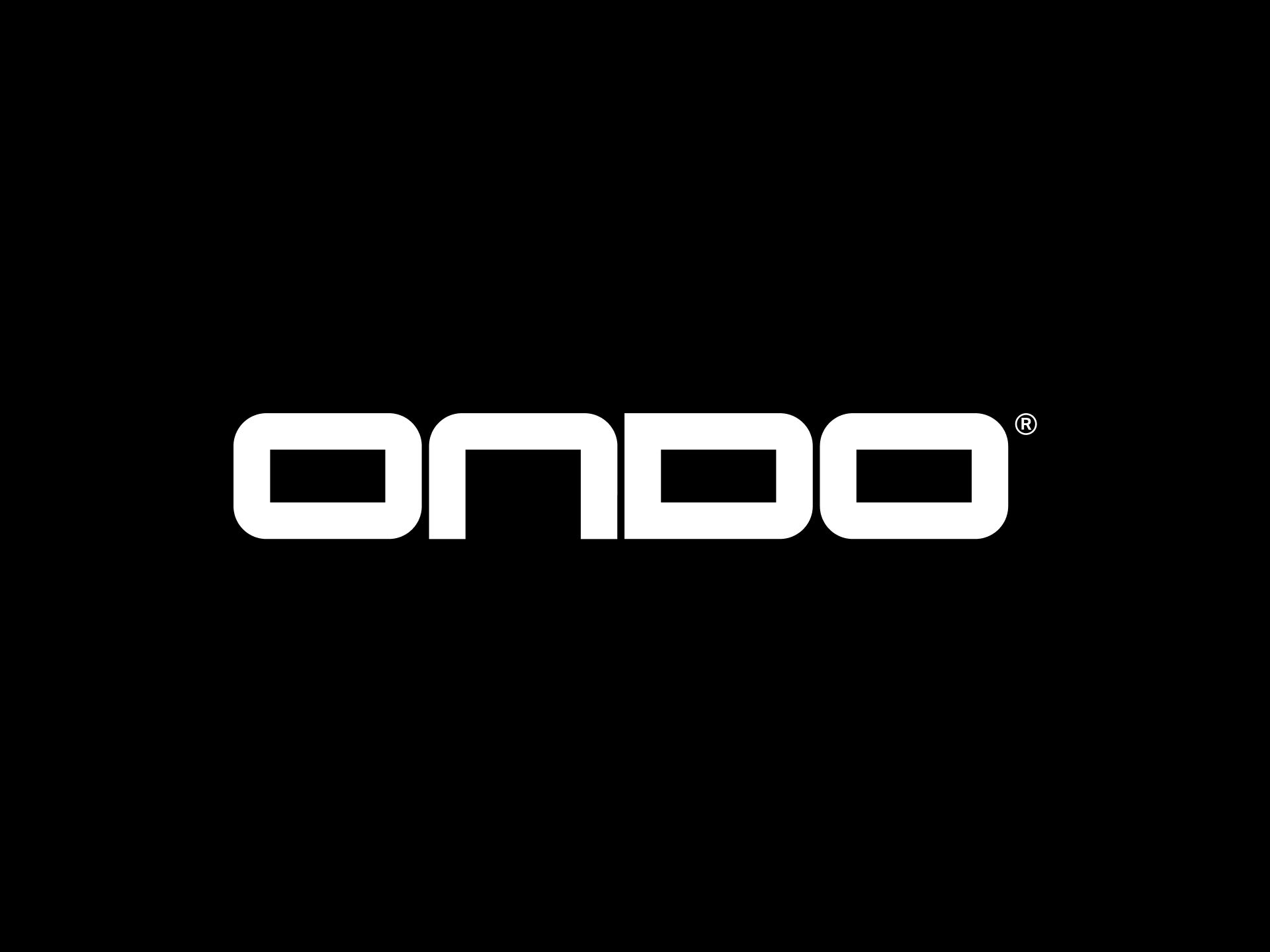
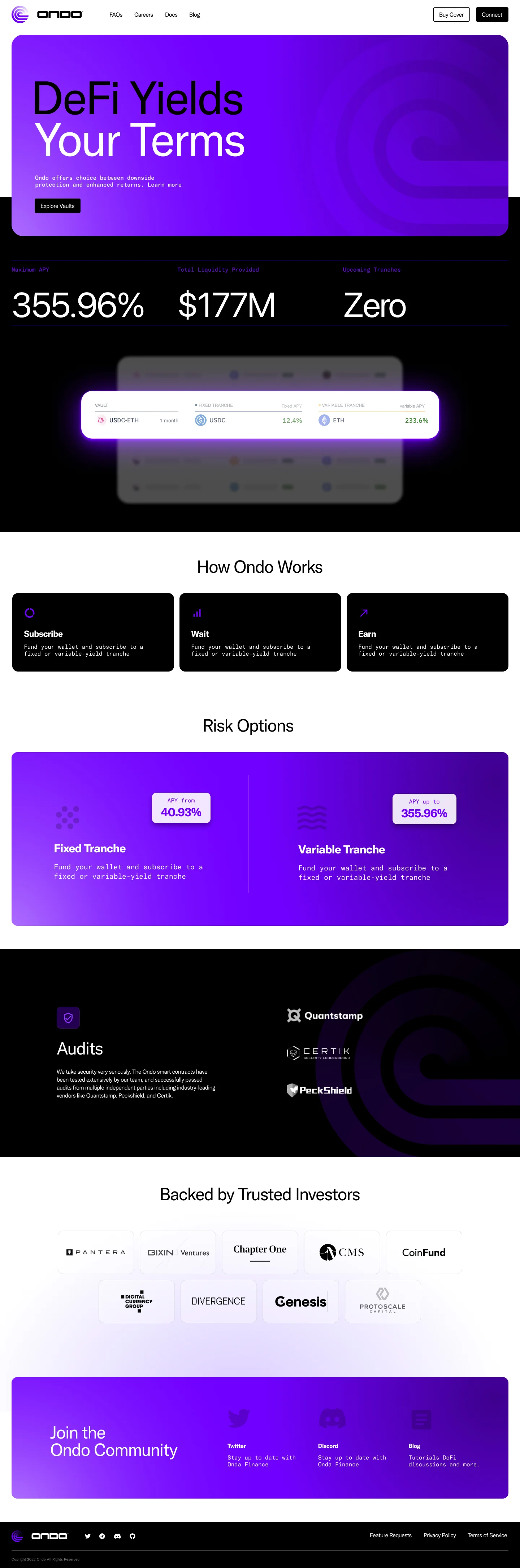
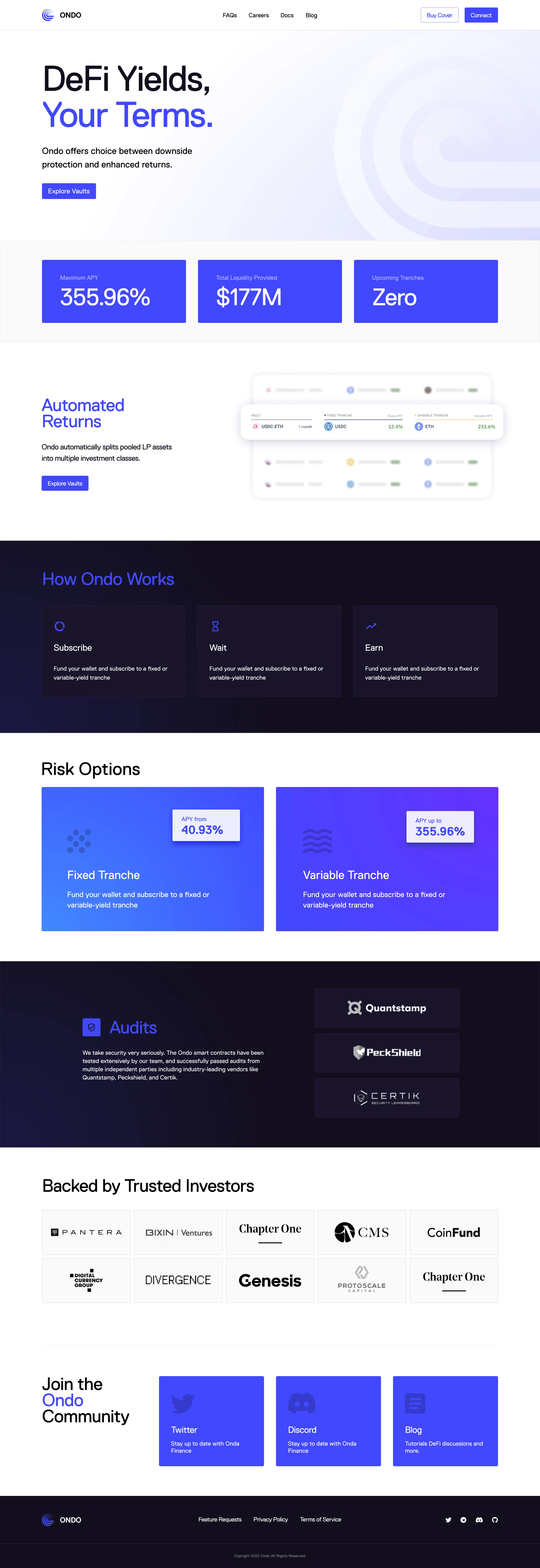
We then developed two approaches to the site design with the updated logo and word mark.
The first direction larger, bolder, heavier in the use of color and large type scale.
The second direction more subdued, functional, with ample white-space, and minimal use of color. Also using their existing brand typeface Replica.
Supporting Team
In collaboration with - Joshua Kaplan
All Projects
Pinecone Website
Kumo.ai
Pinecone Branding
Vector Generator
Thrive UI v3.0
Thrive Brand
Thrive Website
Mental Health Pledge NYT
Superplastic × Gucci
Temper Identity
Ondo Identity
Brandsite.design
Burton Snowboards Brand Identity
Burton Brand Guidelines Site
Seasonal Brand Direction '21
Burton Riders Book
StepOn Identity System
Brand Ads
Outerwear Character Animations
2018 Fall Consumer Catalog
Printed Posters
Various Projects